

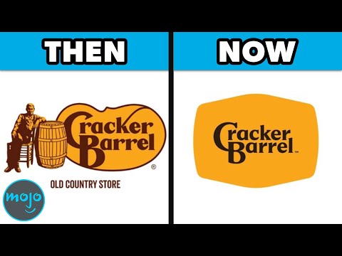
When brands try to update their image, sometimes they miss the mark completely! Join us as we count down our picks for the logo redesigns that left customers confused, angry, or just plain unimpressed. From six-day disasters to multi-million dollar mistakes, these rebrands prove that newer isn’t always better! Our countdown includes Gap’s swift social media roasting, MySpace’s blank space fiasco, Weight Watchers’ confusing "WW" rebrand, Royal Mail’s brief "Consignia" era, and Hershey’s unfortunately suggestive Kiss icon. Which redesign do you think was the most spectacular failure? Let us know in the comments below!
Become a channel member to get access to special perks:
https://www.youtube.com/channel/UCaWd5_7JhbQBe4dknZhsHJg/join
Play our Daily Point Battles to earn MojoPoints and qualify for CASH BATTLES! Check it out: WatchMojo.com/play
Have your idea become a video!
https://wmojo.com/suggest
Subscribe for more great content!
https://wmojo.com/watchmojo-subscribe
Visit our shop for awesome merch!
https://shop.watchmojo.com/
Your trusted authority for Top 10 lists, reviews, tips and tricks, biographies, origins, and entertainment news
#Branding #LogoDesign #Marketing #Gap #MySpace #Yahoo #WeightWatchers #RoyalMail #JCPenney #Jaguar #CrackerBarrel #DesignFail